
Through this project, I introduced the concept of UX testing data widgets at the point of production. Through this approach, I refined the widget’s core design based on end-user feedback before it was published in our design system.
Core team: 1 Developer, Myself as the User Experience Designer and Researcher, 1 Quality engineer, 1 Software Process Engineer.
Timeline: Feb 2019 - Apr 2019
This project is under NDA. The case study shared here is only my viewpoint and doesn't reflect MathWorks or any other person working at MathWorks.
MathWorks offers a variety of products under the MATLAB and Simulink umbrellas. These products directly help support Research and Development efforts undertaken in various industries and scientific domains.
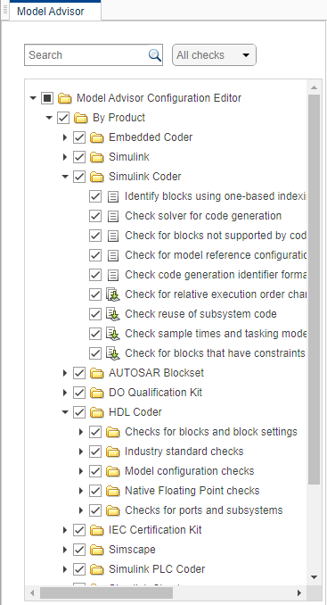
A Tree widget is used in many MathWorks product UIs to show a hierarchy to the users visually.
Users may want to select a tree node and view or edit details about it, carry out other operations on it, or even change the tree’s structure.
As part of providing interactive capabilities for our end-users, we introduced a feature that allows interactive reordering and restructuring of tree nodes.
While the product’s context dictates why and how users will want to restructure the tree, all end-users will experience the interaction and visual designs that this team bakes into the widget. I wanted to evaluate those specific decisions, keeping the context aside, objectively.
I identified the required states in the interactions. Specifically, I created interaction models to disambiguate between users’ intent to drag a few nodes to reorder and the intent to drag-select a series of nodes.
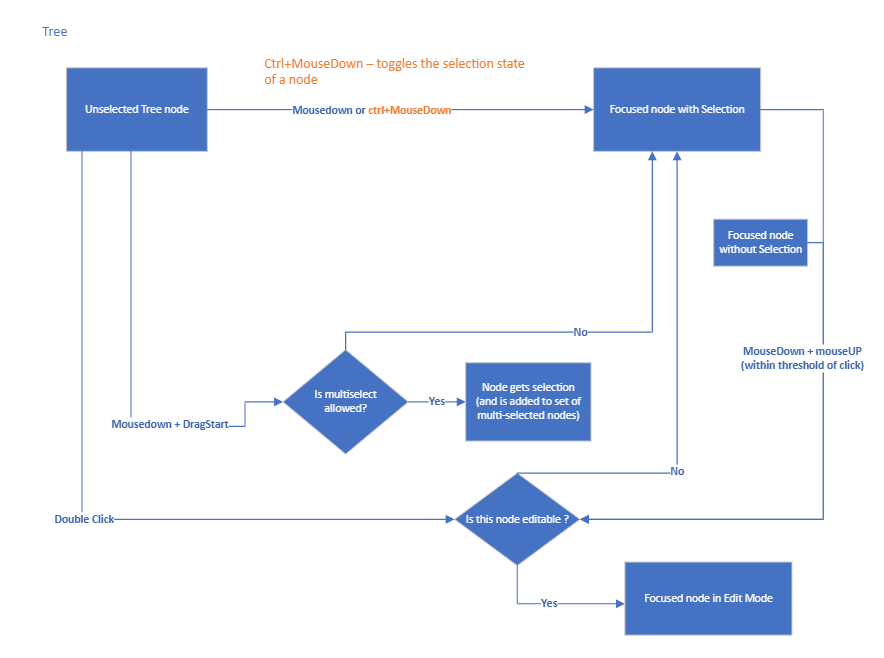
I outlined all the requirements for providing the user’s correct feedback before and during a drag operation and after drop operations. I collaborated with the Visual designer and created the required specifications.
The proposed design provides the end user feedback both, during and after the drag operation. With this design in mind, I had the following research questions to address :
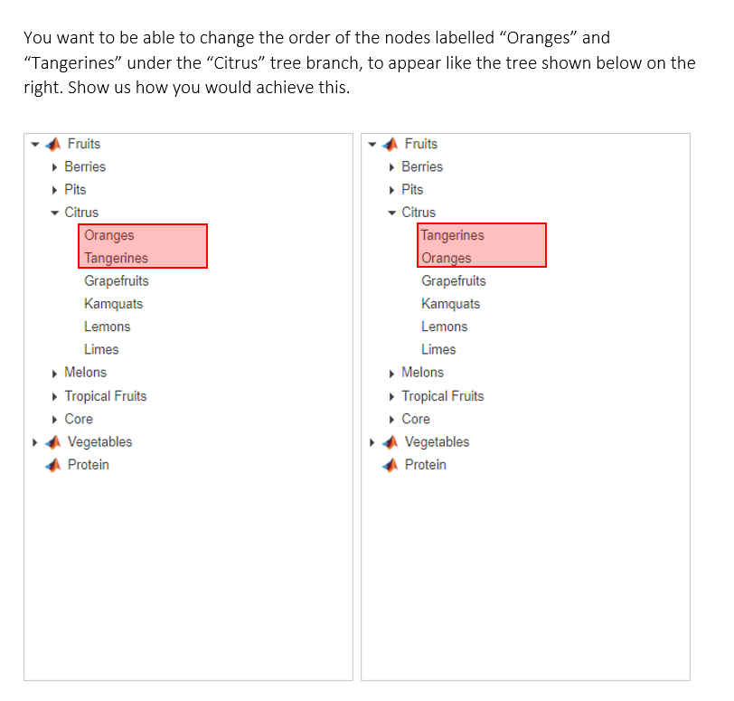
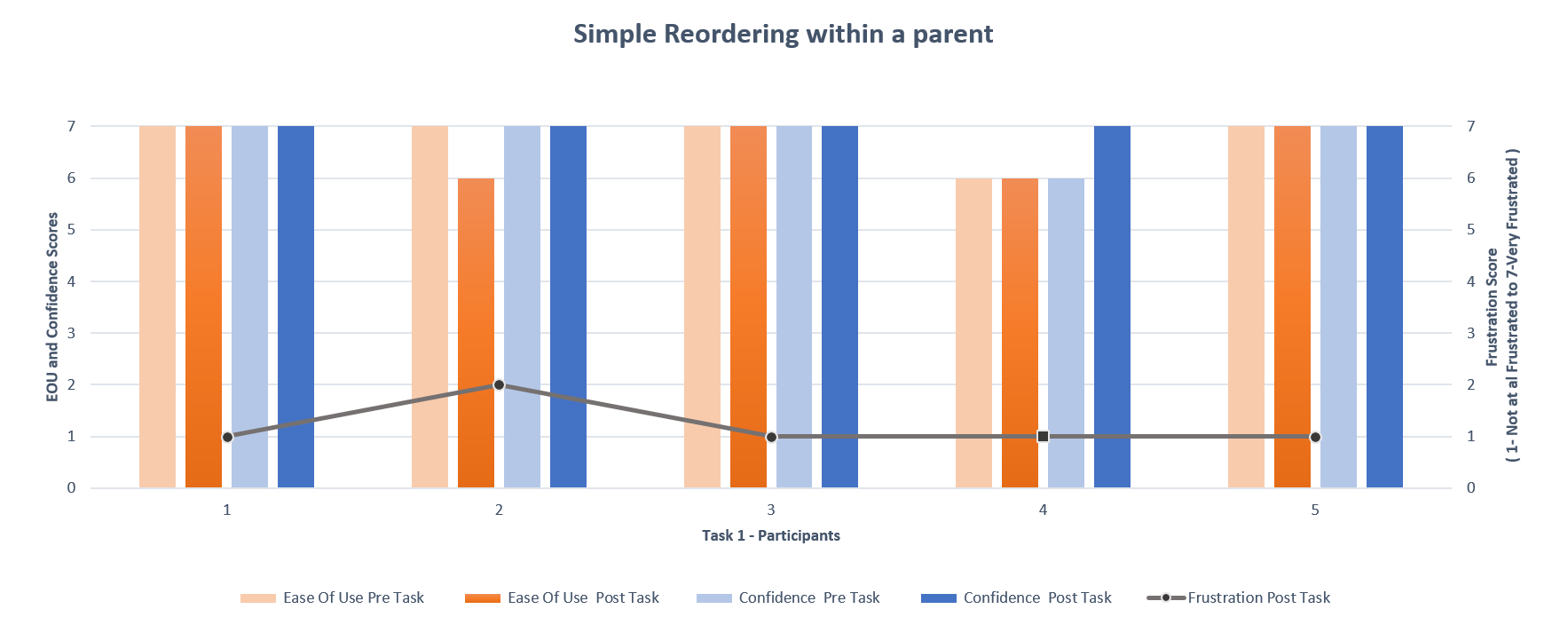
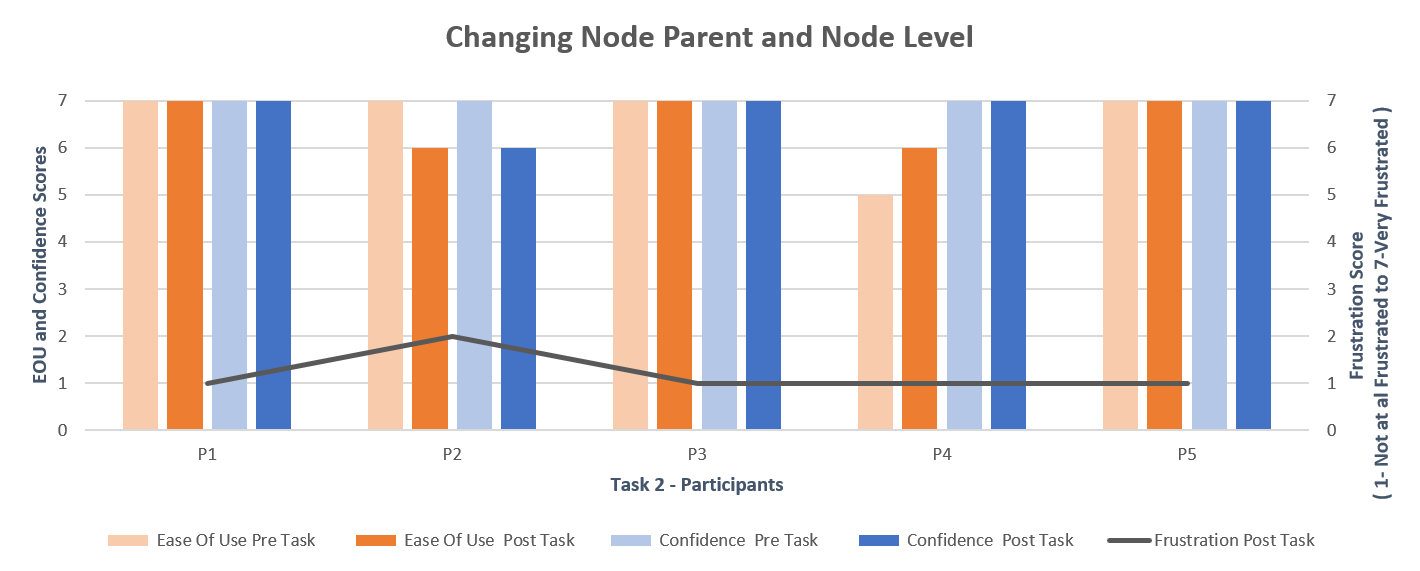
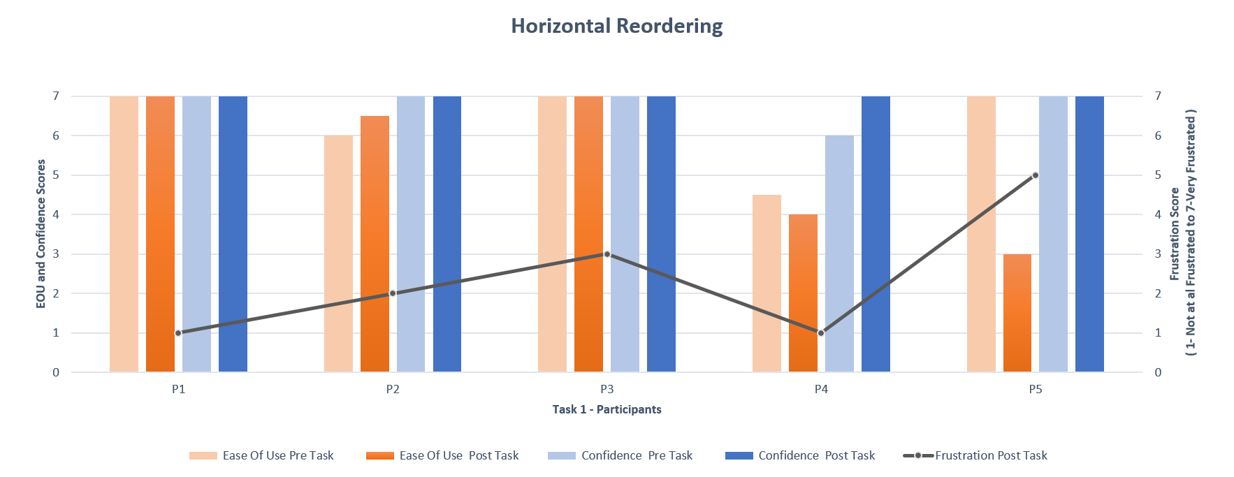
I outlined four tasks, each directed at addressing one or more of the research questions.
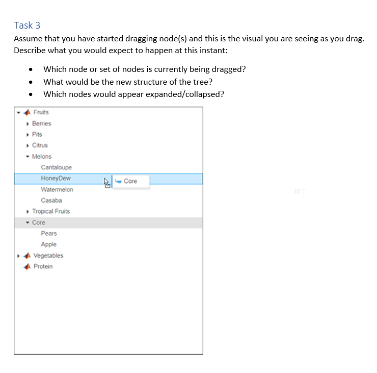
For one of the tasks, I simply showed the participants a screen-capture. I asked them to assume the screen-capture represented the state mid-drag. I asked them what they would expect to happen if they were to “drop” at that point.
I chose this format to collect data because I wanted to specifically collect feedback on the feedback that the visuals provide to the user.
I ran the above study with five users within the company who I had identified as prospective users of this component.
Each session lasted 30 minutes and I collected the following data for each task.

The Blue icon looks like a folder. I assume it is going to change this node's parent.
Based on the test findings, I made the following design recommendations.


In this project, I learnt that I could come up with concrete design recommendations even with low-cost research solutions. Based on this lightweight testing, we pre-empted a bunch of usability issues before the widget was published to the design system, saving a lot of time and effort.
When I first proposed to UX test this feature in a context-agnostic widget level, it was met with some hesitation. I was able to convince the stakeholders of the importance of usability testing and come up with a low-cost solution to achieve this outcome effectively.